THE DISTRIBUTION BULLETIN ISSUE #27
The previous Distribution Bulletin - “Your Website Sucks!” - received a great response. Many subscribers found it very helpful and forwarded it to friends and colleagues. A few people took it personally, thinking it was a critique of their websites, which I assure you it was not.
I’m excited to publish the second part of this invaluable guide to creating a better website. In the first part, James Franklin and Kieran Masterton highlighted 5 critical mistakes to avoid. Here they detail 5 more serious mistakes. Their guide grows out of their work on the frontlines, building sites for independent filmmakers at Assemble and at their previous companies.
Their recommendations are practical and clear. There are very few sites that haven’t made some or many of these mistakes. After you read Part 1 and Part 2, I’d recommend doing a quick assessment of your site and making a plan to improve it. The longer you wait to make changes, the more it will cost you in lost opportunities, revenue, and impact.
- Peter Broderick
5 More Critical Website Mistakes & How to Avoid Them
by James Franklin and Kieran Masterton
Mistake #6. Not Having a Call-To-Action

Make sure people can find you!
A call-to-action is a piece of direction you give to the user viewing your website; it’s usually the action you want the user to take having visited a page on your site. The action should help you fulfill your goals. For example, a call-to-action could be “Watch now for $3.99” or “Back us now on Kickstarter!” or “Request our film when it comes to your city” - these are all strong, directive instructions to the user. It’s important each page on your site has a clear call-to-action. Don’t make the user think when looking at your website.
Some of the most common errors are: failing to link to where someone can watch or buy your film; overwhelming the user with too much choice; focusing on the wrong call-to-action (one that doesn’t serve your goals). For example, don’t put, “follow us on Twitter” front and center instead of “Rent my film on iTunes.” Be sure not to leave an old call-to-action on your site after a campaign or release window has ended. Don’t ask people to “back us on Kickstarter” after the campaign is over and don’t ask them to “request our film in your city” after your Tugg tour has finished. Make sure your calls-to-action change over time so they reflect your current goals.
Checklist:
- Don’t make people think
- Keep your calls to action simple and make sure you always have at least one
Mistake #7. Bad User Experience

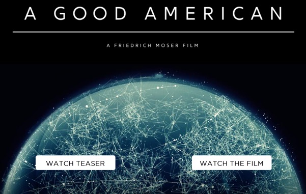
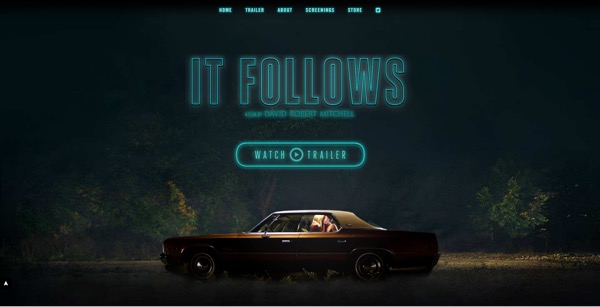
An example of good design
Ugly design, bad user interactions, and confusing site navigation all contribute to poor conversion rates. The worse your design, the more confusing it is for users to interact with your site, the less likely they they will follow your calls-to-action. This ultimately means less sales, pledges, requests, follows, or mailing list sign ups; whatever it is you’re trying to achieve will be hindered by poor design and bad user experience.
Some key things to remember in order to avoid this problem:
Make your site’s design image driven, not text driven. Film is a visual medium and a creative product; you want to illustrate that with your design. This will also help when international audiences who don’t speak your language are viewing your website.
Maintain your film’s brand throughout - from your poster through your website and beyond. If you already have a poster, your site should use the same design style. Don’t forget your social networks- they should also be branded to create a visual connection with your other marketing materials. If users spot your trailer on YouTube and then Google your film, they should know that they’ve found the right film the instant your film’s website loads.
Ensure your site is mobile friendly. We’ve all been on the phone and followed a link on a social network to a film’s website only to be forced to pinch and zoom to read the text or play the trailer. This isn’t good enough. When you commission your site, it’s vital you make sure that it’s going to be designed to be responsive/adaptive. This will enable your site to respond and adapt to the size of the screen on which it is being viewed.
If you’re working with designers, help them determine the visual hierarchy of your site by discussing the most important content and where it’s placed. This should be driven by your current goals. Screen size plays a big part in how a user perceives the content on your site. Ask your designer how the site will look on mobile or tablet vs. on a laptop or desktop and and make sure all versions of the design achieve the film’s goals. If that goal is to sell VOD, are your calls-to-action front and centre on both mobile and desktop or are they buried and hard to find on mobile?
Mobile has now overtaken desktop as the most popular device on which to view media. At 51% vs. 42%, it’s vital that you ensure your site is accessible on mobile devices.
Checklist:
- Remember mobiles - check your site design on your phone and tablet
- Maintain brand or ‘look’ consistently across your site, social media, and VOD platforms
- Imagine you want to watch your film, how would do you it - check it actually connects up
Mistake #8. Not Thinking Globally

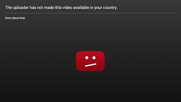
There’s nothing more frustrating than being locked out of buying a film
When you read about the latest hot indie film and follow the link to watch it, you don’t want to be greeted by a sad YouTube face or a generic “This content is not available in your region” message. Those living outside the continental United States are all too familiar with this experience. While the old world of film distribution is still focused on territory-based sales, it’s important to remember that the web is an international marketplace. You shouldn’t restrict your appeal to people from your country of origin, territories where you’ve sold your film to a distributor, or big markets like the US or UK.
Use geo-technology to be as inclusive as possible. Allow rights holders in different territories to control their release in that region but ensure that isn’t at the expense of those in the rest of the world. Releasing an international trailer with a mailing list sign-up piques audience interest, whereas a door-slam geo-blocking message infuriates your potential audience. It is also important to use inclusive language, offer internationalized pricing, and provide subtitles for your film to ensure you have the broadest appeal possible. Turn a geo-block into a geo-opportunity by asking people to sign up if the film isn’t available in their region yet. You can avoid making people feel unwelcome by using as much visual communication as possible, limiting your written content to the bare minimum, and using universal iconography to denote important functions such as buy, search, download, etc.
Ultimately, it’s about adapting your marketing to the global marketplace. This can be hard when deals with distributors appear restrictive and the technology seems daunting. Geo-detection can be used to block, but it can also be used to direct audiences to the best possible experience for them. For example, let’s say you’ve made a dark, indie thriller: you’ve had some festival success, and sold the rights to Sweden and the US. Those distributors want to exclusively promote the film in their region unimpeded by other distributors. You want them to do this as successfully as possible, after all that’s what they do best and it’s why you sold your film to them.
You also need to remember there’s an enormous audience for your film in the rest of the world. You should make sure your film is directly available from your website in all territories where no company has acquired the rights. What you need is one website that you control and has default content that’s displayed as standard around the world. The site should have an international trailer and a place to join your mailing list so that you’re growing your audience in every region of the world. The website should be capable of serving different content to users in different territories. These versions of the website should be sales focused and could be controlled by the distributors in each territory where you have a made deal.
Checklist:
- Geo-filter your site, trailer, and mailing list to adapt to users in different regions
- When traveling, try out your content, VOD platforms, and website from other countries
Mistake #9. Failing To Use Your Mailing List

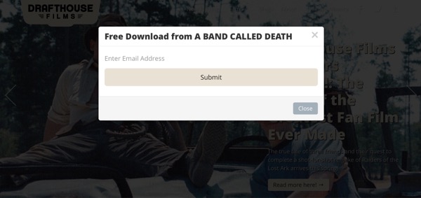
Giving away something for free is a great way to grow a following
Mailing lists can be extremely powerful.They are a fantastic tool to connect you to your audience and to sell effectively, but they have to be used correctly.
In the age of abundance, information overload is a real problem. Fear of missing out leads consumers to look for the most direct and effective means to find out about things they don’t want to miss. The best way to ensure this is to have news delivered straight to their inbox. For this reason alone, it’s vital that you have a mailing list and take the running of your list seriously.
All too often we hear, “I had a mailing list but it didn’t really work.” Without a clear strategy, a mailing list can quickly turn into a device for spam. Here are some vital points to remember when running a mailing list:
Share don’t sell. It’s all too easy to bombard your list with spammy, buy-buy-buy-style emails that make you look desperate. Instead, try to build a relationship as you would with a person- share your experience, insights, things you find interesting, and provide extra value through exclusive behind the scenes content. Think “would I want to receive this in my already crowded inbox?”
Keep screening information local to the subscriber. Collect a user’s location when they sign up for your list and ensure they only receive event information that’s relevant to them. There’s nothing worse than living in London and reading that there are 5 screenings happening next week in Boston.
Give things away for free. This can be valuable knowledge related to the content of your film, practical information on how you made it, or free posters with every Blu-ray order. Give the mailing list subscribers something nobody else has and give it to them for free, like you would a friend. The more generous you are, the more supportive they will be on this and future films.
Don’t underestimate the relationships that can be built using mailing lists, don’t spam people, and don’t maintain total radio silence. Deliver value to people’s inboxes and you’ll be rewarded.
Checklist:
- Set up your mailing list
- Give people a compelling reason to join it (rather than self-promoting updates)
- Set a calendar reminder to send out something every few months
- Review your extra content - can you share something for free?
Mistake #10. Not Starting Early

The earlier you start, the bigger your final audience
Haven’t got your film’s website set up yet? Start now! Start as early as you possibly can. Doing so buys you precious time to grow an audience, forge relationships, and encourage people to feel invested in your film. It allows serendipity to happen. It’s very easy to sit back and de-prioritize your film’s website, but ultimately getting an early start will translate into crucial fan support at every stage of your film’s lifecycle.
Usually, the first 100 people who discover your film and join the mailing list will be more valuable to your distribution efforts than the last 100 people. Think of that feeling you get when you discover a band before they become popular. The same is true with films. Early adopters will often be your keenest advocates and most loyal fans. If you don’t have a place for them to interact with you and your film early on, you will lose valuable opportunities.
As soon as you have a website, your audience will be able to start following your story. Your site will enable you to show them your personality, to be memorable, and to take them on a journey with you through the planning, making and distribution of your film.
Your film’s website is a powerful asset that develops with your film. It should never be an afterthought that you throw together without thinking. Starting early means that you can have your website help you achieve each of the vital goals you set for your film.
Checklist:
- Don’t go for perfect first time round, get something simple up early and build on it
- Give early adopters something to do, they will support you
My Website Checklist:
1.) Register the domain name as soon as you have a name for your film
2.) Use your email to register the domain and set it to auto renew
3.) Set up a simple website and mailing list as early as possible
4.) As you progress through each stage of your film, review the following:
a.) Does my website reflect my current goals?
b.) Have I updated my mailing list with what’s happening?
c.) Is my personality coming through?
d.) Is the design attractive and consistent across all my digital presence?
5.) When you enter the distribution stage, review the following:
a.) Can people find where to buy the film?
b.) Do the site and trailers work internationally?
c.) Should I be geo-filtering to make my site more friendly internationally?
(This was a two-part series. Didn't get the first part? Want to make sure you never miss valuable information like this? The Distribution Bulletin is sent to subscribers who are working to have their films succeed in an ever-changing marketplace. If you are not already a subscriber, you can subscribe here. - Peter Broderick)
© 2016 Peter Broderick