THE DISTRIBUTION BULLETIN ISSUE #26
How much is your website costing you in lost opportunities, supporters, revenue, and impact?
Your website can enable you to maximize your film’s distribution. It can also help you build a powerful personal audience and have a sustainable career. Unfortunately, few independent filmmakers understand the importance of having an effective website let alone how to build and maintain a great site.
“Independent film websites are frankly dreadful and getting worse” is the latest assessment of an expert with a broad awareness of such sites. “They lack appropriate tone, goals, direction, voice, content, usability-–the list goes on.”
Filmmakers are constantly asking me to point them to exemplary websites but there are fewer and fewer I can recommend. So I reached out to James Franklin, one of the world’s leading creators of independent film websites, and asked him to write a Distribution Bulletin on how not to design a website and how to fix the one you have (see also How Not to Negotiate a Distribution Deal). James and his teammate, Kieran Masterton, have been building film websites for over ten years. Their company, Assemble, has done exceptional work for a host of independent features and documentaries, including CITIZENFOUR, Virunga, It Follows, The Square, Cartel Land, Dirty Wars, and How to Survive a Plague.
I’m very pleased to publish – in two parts – this invaluable guide. It will empower you to assess your website, identify what you have done wrong, and learn how to improve your site. The guide is a short crash course you can’t afford not to take if you want to achieve your site’s full potential.
- Peter Broderick
10 Critical Website Mistakes & How to Avoid Them
by James Franklin and Kieran Masterton
Mistake #1. Not Having a Website

Make sure people can find you!
This should go without saying but sadly it’s far more common than you’d think. The temptation is to think that you’ll leave stuff like this to the distributor or you’ll deal with a website once you’re in post or when you get into a festival, but this is a critical error. You need a website from day one, ensuring you connect with your audience early and giving you the time to build a relationship before your film’s release.
Your film’s website is many things to many people--it’s a hub connecting all the disparate social, commercial, distribution and marketing activities that happen all around the web. It’s your film’s home on the web and wherever someone might discover your film. It’s where you want your audience to ultimately connect with your film. This ensures the strongest possible connection between, you, your film and your audience.
And no, a Facebook page alone won’t do! Why? Because with Facebook, or any other social network, you don’t own your audience, you can’t take them from one project to the next, they’re locked into someone else's network. Likewise, Facebook’s one-size-fits-all solution is not going to best serve your film or sell your film effectively. By all means have a Facebook page, but consider it one of many marketing assets, not your home on the web.
Whatever you do, don’t forget or put off creating a website for your film. Act now or you will be missing out on valuable early fans who could become influencers. Your website and mailing list are where the magic of serendipity happens.
Mistake #2. Failing to Define Clear Goals
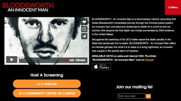
The current goals of this site are very clear
This is about planning. Too often the strategy behind a film’s website is, “We need a big trailer and a link to buy,” but we all know selling films isn’t that easy. Likewise, a common approach is “I really like the website for film X or film Y, let’s copy that.” But what you really have to ask yourself is: what are the current goals for my film? Once you’ve established those goals, you can design how your site is going to help you achieve them.
Producing a website for an impact documentary that is in production and looking for finishing funds is very different from creating a website to sell a genre film direct to audiences in the Scandinavian market. You should plan your website carefully, lay out your current goals, whether that be funding, creating social impact, changing minds, promoting your film’s appearance in festivals or selling the film direct. The website design, layout, calls-to-action and language will all be very different depending on your goals.
Remember your site will evolve throughout the film’s life and should serve different goals at different times.
Checklist:
- Align your website design and layout with your current goals
- As your goals change, remember to change your website
Mistake #3. Forgetting the Basics

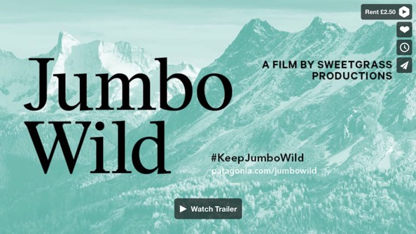
Put your trailer up front and center
This is fundamental but all too commonly forgotten. What you should consider to be “the basics” is going to depend on the current goals for your film. That said, there are some golden rules:
Show us the trailer, don’t hide it away on a trailer page; your trailer is the best tool you have to sell your film. Don’t make a user click through to view it.
Whatever you do don’t forget contact information. It sounds simple, but it’s vital. Email is a must and a phone number is preferred - you never know, a sales agent might call. Adding a street address to your emails will reduce the likelihood of getting caught in spam filters.
Remember your press kit and press-specific contact information. At a minimum this should be the synopsis and a small but good selection of high-res photographic stills. The more eyeballs you can get on your film the better. Give the press the best possible resources to paint your film in the best possible light. Is your film screening at festivals, and better yet, has it won awards? Don’t be shy, list your screenings, promote ticket sales, display your laurels with pride.
Don’t forget to make sure your site is as discoverable as possible. This means ensuring that each page of your site is optimized to give search engines the best chance of indexing them and accurately gathering information about them. The more optimized the content and the metadata on your pages, the more Google will reward you with traffic. Search engine optimization is a big subject. For more information read this guide to ensuring your site is discoverable.
Checklist:
- Make sure contact details are on the site
- Check your site’s search engine optimization (do a test search in Google)
- Check your site in social media (do a test share of the URL in Facebook or Twitter)
- Add your press kit, trailer, awards, reviews and showtimes
Mistake #4. Losing Control of Your Domain

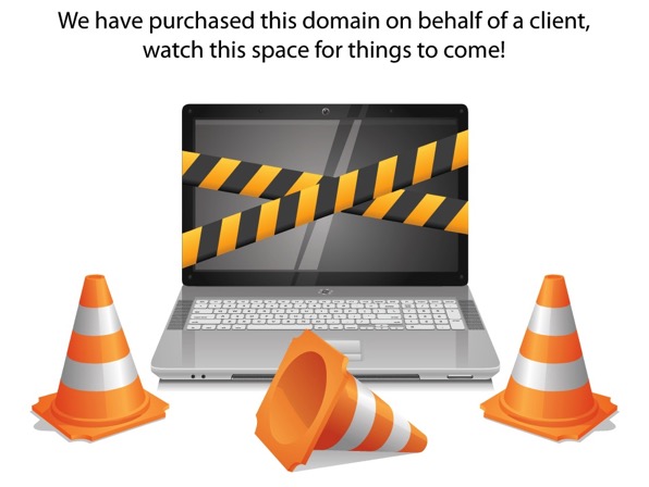
Uh oh - where’d my site go?
This is a disaster, but a very common disaster. You’ve had an idea for a film and at the height of your excitement and motivation you register the perfect domain name. Two years of pre-production, planning, financing etc. pass and now you’re in production and you want to launch a teaser website-- but what’s happened to that domain? It’s expired and someone is cybersquatting your domain - nightmare!
The other oh-so-common version of events is that an intern or assistant registered the domain to their Hotmail address and you’re not in contact with them anymore. Your domain is one of the cheapest, but most valuable things you’ll purchase for your film and a simple administrative error can see it slip through your fingers.
Make sure you register the domain yourself to an email address you regularly use, store credit card details with the registrar, and set the domain to auto-renew. These simple tips will stop you from losing such a critical asset.
Checklist:
- Register your domain using an email address you use regularly
- Set your domain to auto-renew
- Save your payment details
Mistake #5. Not Being Memorable
People don’t really want to buy from a faceless corporation, particularly one they’ve never heard of. A lot of filmmakers make the mistake of wanting to hide behind a company name or brand, thinking it makes them look more professional, but don’t forget, people really want to buy things from other people.
When it comes to art or entertainment, people buy from interesting, memorable people. There’s huge fatigue among consumers in the entertainment marketplace at the moment as a result of the ridiculous abundance of content. You have to stand out, you have to ask yourself what’s going to make people care. In a world where no one has any time and yet everyone is bored, how do you make you and your film unique?
You have to make your website personal, it has to about you and it has to be authentic. Show personality, include humor if that’s you, write in the first person, but most of all, you have to be memorable. Filmmakers like Franny Armstrong, Hal Hartley, Sally Potter and Kevin Smith have all achieved this in their own unique ways, but most importantly their personality is at the heart of how they promote themselves and their work.
The success that these and many other filmmakers have had is partly to do with the personal audiences they have built. Namely the followers they have, or the following their work has. Some have built this following through email, their website and social media. Building a personal audience brings huge benefits in terms of support, resources, finances, feedback and reach. This is the ultimate goal. Nurturing a personal audience will reap the rewards on each project, but also travel from film to film, building with each project. But having a personal audience requires showing some personality.
Checklist:
- When sending emails, use your voice and personality - be real, be authentic
- Review how your personality comes across in the website content
- Use design to inject personality into your site
(Don’t miss Part 2 of Your Website Sucks! which will be sent to Distribution Bulletin subscribers next month. It will highlight 5 more critical mistakes and reveal how to avoid them. If you are not already a subscriber, you can subscribe here. - Peter Broderick)
© 2016 Peter Broderick